The Underturn

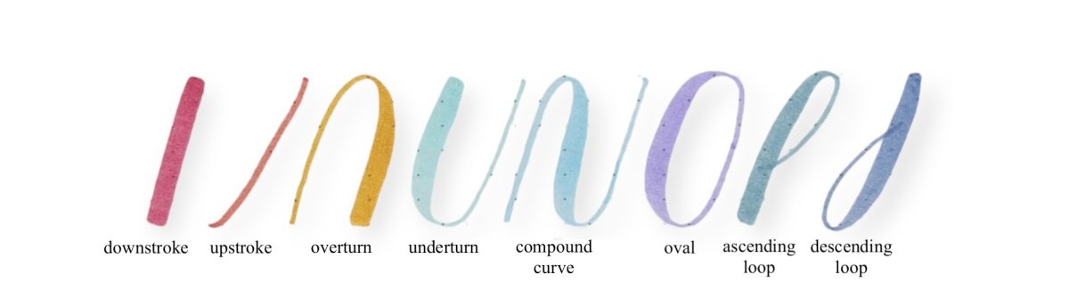
Let’s explore the underturn, a fundamental stroke commonly found in lowercase letters such as a, i, u, and w. The underturn is characterized by its u-shape, starting with a thick downstroke that transitions smoothly into a thin upstroke.

To create an underturn, begin with full pressure at the waistline. As you move toward the baseline, gradually release the pressure. When you reach the baseline, your stroke should have transitioned into a thin line. To achieve this seamless transition, start releasing the pressure about two-thirds of the way down. After reaching the baseline, continue upward with light pressure until you return to the waistline. The upward portion of this stroke is essentially an entrance stroke.

Figure 1 Release pressure when you reach the baseline

The underturn also appears in lowercase letters like d and t but with a taller stem. For these letters, begin the full-pressure downstroke and proceed as you would with a standard underturn.


The word ‘minimum’ is an excellent choice for practicing underturn strokes because it contains multiple repetitions of this fundamental shape. Each “n,” “u,” and “m” in the word requires careful execution of the underturn, making it an ideal exercise for building consistency and control in your lettering.

As you write ‘minimum,’ focus on creating smooth transitions between the thick downstrokes and the thin upstrokes. Pay special attention to maintaining even spacing between each letter and ensuring that the height and curvature of each underturn remain consistent. This repeated practice will not only help you refine the underturn stroke but also improve your overall rhythm and flow when lettering.

Start with slow, deliberate movements, and gradually build up speed as you become more comfortable. Practicing ‘minimum’ regularly will strengthen your muscle memory and help you achieve greater precision in your brush lettering. Download the practice sheets below and get started now!

Fundamental Strokes in Brush Lettering

These foundational strokes will set you up to create all of the lowercase letters in brush calligraphy. Get to know the strokes in your mind before you pen them. Practicing these strokes individually will help you create consistent letterforms.

Downstroke

The full-pressure stroke is a fully shaded downstroke with a square top and bottom. It is found in all letters. It should extend along the slant angle from the first ascender to the first descender. You can always practice this stroke at longer or shorter lengths as well.

Overturn

Place the tip of your brush pen nib at the baseline. With no pressure, draw a curved line up and to the right toward the header line. Make sure the straight portion of the hairline is parallel to the slant angle. Once you are at the header line, you can either lift or continue the curve over and down, gradually applying more pressure. Release the nib to snap the tines together, creating a square bottom.

Underturn

The underturn is the reverse of the overturn. Place your brush tip on the header line and draw a dash to create a square top. Make sure the stroke is parallel to the 55-degree slant angle and that the pressure is even. Pull down to create a shade, and as you near the baseline, slowly release pressure and form a curve that comes to a point at the baseline.

Compound Curve

The compound curve is a combination of overturn and underturn. Draw a curved line up, then apply pressure, pull the shade down toward the baseline, and finally let the left tine meet the right at the bottom to close the shape. There should be an equal distance between the overturn and underturn.

Oval

The oval shape is important because it is the basis for many of the shapes in the brush lettering. It is found in the letters a, c, d, e, g, o, and q. Begin the top of the shade at the header line. The shaded portion of this shape can be thought of as half of a coffee bean. At the bottom of the shade, at the baseline, draw a hairline up, out, and back over to meet the top of the shade at the header line. You can see the similarities in the bottom of the oval to an underturn and the top of the oval to an overturn.

Ascending Loop

The ascending loop is found in the letters b, f, h, k, and 1. Draw an upstroke and direct the upstroke toward the left and down along the main slant angle to form the beginning of a loop. Start to apply pressure on the brush tip, then pull a full-pressure stroke down, being sure to square the bottom of this stroke. Note that this stroke does not come to a square bottom when applied to the lowercase b and l, but rather ends like an underturn. The top portion of the ascending stem loop should be all hairline.

Descending Loop

The descending loop is simply the opposite of the ascending loop. Draw a full-pressure stroke down along the slant angle and start to release pressure. The curve of the loop, as in the ascending loop, should all be an upstroke. Draw the upstroke back up, stopping once you reach the shade. When you are drawing letters such as g, j, and q, you do not want to pull ink through, so lift and then draw the exiting upstroke on the other side of the shade.

A Step-by-Step Guide to Writing “Happy Mother’s Day” in Calligraphy

A Step-by-Step Guide to Writing Happy Mothers Day in Calligraphy

Mother’s Day is the perfect occasion to express your love and gratitude to the incredible women in your life. What better way to do this than with a beautiful, handwritten message in calligraphy? In this post, I’ll guide you through the steps of writing “Happy Mother’s Day” in elegant styles, complete with free downloadable practice sheets.

Calligraphy Materials Checklist

Before we start, here’s what you’ll need:

  • Calligraphy brush pens with small tips
  • Quality paper or greeting card stock: glossy or photo paper (A5 or A6)
  • Practice sheets (download is available below)
  • Pencil, ruler, and eraser for guidelines

Brush Pens with small tips

Must-have brush pens for perfecting your calligraphy practice:

  • Pilot Futayaku Calligraphy Brush Pen
  • Pentel Fude Touch Sign Pen
  • Tombow Fudenosuke Brush Pen
Figure 1 Pilot Futayaku Calligraphy Brush Pen
Figure 2 Pentel Fude Touch Sign Pen
Figure 3 Tombow Fudenosuke Brush Pen

How to Write ‘Happy Mother’s Day’ in Calligraphy

  1. Get Your Workspace Ready: Choose a comfortable, well-lit area.
  2. Warm-Up Strokes: Practice basic lines, curves, and loops with your pen
  3. Break Down the Phrase: Focus on one word at a time—practice “Happy,” then “Mother’s,” and finally “Day.”
  4. Use Guidelines: Draw light pencil lines to ensure consistent spacing and size.
  5. Perfect the Composition: Align the words artistically, leaving room for decorations or flourishes.
  6. Add Personal Touches: Incorporate flowers, hearts, or abstract elements to elevate your design.

Tips for Beginners

  • Do not rush—take your time to perfect each stroke.
  • Start with pencil drafts
  • Practice regularly to build confidence.
Figure 4. Final work of Happy Mother’s Day

Learn how to write ‘Happy Father’s Day’ in elegant calligraphy with free templates. Perfect for heartfelt cards and creative gifts. Download and practice now!

Happy Father's Day in brush lettering calligraphy
Write 'Happy Father's Day' in Calligraphy: A Beginner Guide
Figure 5. Final work of Happy Father’s Day
Happy Father's Day in brush lettering calligraphy
Figure 6. ‘best dad ever’ in brush lettering calligraphy

Intro to Loose Watercolor Florals for Beginners

If this is your first time doing a watercolor painting and you have no ideas what to prepare, perhaps you may find the list below helpful:

Supplies

  • 1 x Pentel Aquash Brush Pen (Broad and Fine Point)
  • 1 x Watercolor set and palette
  • Watercolor papers (200gsm/300gsm)

Product Recommendations for Beginners

Where do you get your art supplies during CMCO?

These are my favorite sellers who provide free delivery.
Huanyo
Vcartstat
Miyawk
Mypaponline
Download the user guide below:

How to Improve Brush Lettering

brush lettering class Kuala Lumpur Malaysia
Here are some of the common issues with brush lettering beginners:

1.Shaky upstrokes

Go slow and focus when you are practicing your upstrokes. Movement should be generated at your wrist when you create a thin upstroke.

2.Thick Upstrokes

Focus on consistency to build your muscle memory. The small brush tips create finer and thinner upstrokes. If you notice you have thick upstrokes, try to add more pressure on your downstrokes to create contrast in a letter.

3.Inconsistent slant

Use guideline sheets to keep a consistent slant. Hold your pen 45 degrees to the paper to create a slant line. Always reflect and look at the slant of the previous stroke to improve your consistency.

4.Small Loop

Collapsed loops are due to transitioning too early from thick to thin or vice versa, not enough contrast between down and upstrokes. Always go slow and make a conscious effort to be consistent

5.Heavy/ Uneven Underturn

It is common to see beginners create heavy bottom under turn or uneven pressure on transitioning between thick/ thin strokes. Start off with full pressure downstrokes and when you move toward the bottom/baseline, slowly reduce the wrist pressure to create a thin upstroke

Brush lettering Kuala Lumpur
Comparison between hand lettering without guide sheets and with guide sheets